Can the Wrong Colours, Fonts or Layout Make Customers Trust Your Business Less?
Short answer: yes. Absolutely, yes.
The longer answer is more interesting, and it’s the reason I’ve built my whole business around it.
Before I ever designed a website, I studied psychology at university. People make snap judgements based on things they barely notice, and that fascination never left me. Now I see it play out every day in web design. A potential customer lands on your website, and before they’ve read a single word they’ve already decided how they feel about you. Professional or amateur. Trustworthy or a bit risky. “This is exactly what I’m looking for” or “I’ll keep looking.”
Colours, fonts and layout do a huge amount of that silent persuading. So let’s talk about how to make them work for you rather than against you.
Your website is making a first impression, whether you like it or not
If you’ve been in business for a few years, there’s a good chance your website started life as a DIY project. That’s completely normal. When you’re starting out, you’re juggling a hundred things, and getting something online is a win.
But your business has grown since then. You’ve built a reputation, gained loyal customers and got better at what you do. The question is: has your website kept up? Or is it still telling the story of where you were three years ago?
That gap between how good your business really is and how good it looks online is where trust leaks away.
A real example: the florist whose website wasn’t doing her justice
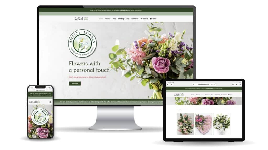
I recently redesigned a website for a florist, and her situation is one I see all the time.
Her old site was cluttered, the navigation was confusing, and the colours didn’t match her branding. She wasn’t happy with it, and, tellingly, her customers weren’t either. They were commenting that the website didn’t do her work justice.
Think about that for a second. Her flowers were beautiful. Her service was great. But her website was quietly undermining all of it.
We kept her logo (with a few tweaks) and built the new site around her existing greens, adding a couple of carefully chosen colours:
- A dark green, which she already used. Green naturally links to foliage, but it also creates a sense of trust. Darker greens carry associations of sophistication and even financial reliability, which matters when you’re asking someone to place an order and pay online.
- A lighter sage green, which we introduced. Sage speaks to nature, stability and balance. It’s calming and helps reduce stress, exactly the feeling you want when someone’s choosing flowers for a special occasion (or a difficult one).
- A coral pink, also new. This reflects the brighter colours of the flowers themselves and brings a warmer, more feminine balance to the greens. Coral feels approachable and friendly, which invites people in.
Alongside the colours, we used her brand fonts consistently throughout and simplified the navigation so finding and ordering flowers was effortless.
The site has only been live for a few days, but she’s already had several orders, and customers have been commenting on how great it looks and how easy it is to navigate and place an order. Same florist, same flowers. Very different first impression. View her website here amalfiflowers.co.uk
The most common trust-killers I see
When a small business comes to me with their existing website, these are the issues that come up again and again.
1. Too much text
This is probably the most common mistake of all. You know your business inside out, so it’s tempting to explain everything. But walls of text put readers off. When content feels overwhelming, people don’t read it. They leave.
Less really is more. Break your content into short, easily digestible sections and use images to give the eye somewhere to rest. Your visitor should be able to skim a page and still come away knowing what you do and why they should choose you.
2. Too many fonts
Every new font you add is another thing your visitor’s brain has to process. Too many creates confusion and makes a site feel messy and unplanned.
My rule of thumb: stick to two fonts. One for headings, one for body copy. That’s it.
The one exception worth mentioning is a script (handwritten-style) font, which can add a lovely sense of personality and approachability for the right kind of business. Just use it sparingly, as an accent, not for paragraphs of text.
3. Clashing colours
Your colours should complement each other, not fight for attention. A palette that clashes feels chaotic, and chaos doesn’t inspire confidence.
That said, there’s one place you want a colour to stand out: your calls to action. Buttons like “Order now”, “Book a call” or “Get a quote” should use a contrasting colour that grabs attention and makes the next step obvious. Harmony everywhere else, contrast where it counts.
4. Inconsistency
This one’s less obvious, but it’s a big one. Your fonts and colours shouldn’t just be consistent across your website. They should be consistent across everything: your social media, your printed leaflets, your business cards, your email signature, your van if you have one.
When someone sees your Instagram post, then visits your website, then picks up your leaflet, it should all feel unmistakably like you. Every time it matches, you reinforce familiarity. And familiarity builds trust.
Consistency creates trust. If you take one thing away from this post, make it that.
“But I really like purple…”
Here’s where I might differ from some other designers.
A lot of people come to a redesign wanting to use the colours and fonts they personally love. And the standard design advice is simple: it’s not about what you like, it’s about your target market.
For larger businesses, I’d largely agree. Your personal taste shouldn’t get in the way of what your customers respond to.
But for small businesses, I think it’s more of a balance, and I don’t think that’s a bad thing.
When you run a small business, you are a big part of the brand. You need to love your brand and your website, because you’ll be proudly sharing it for years to come. And you want to attract customers who are on your wavelength, people you’ll genuinely enjoy working with. So your personality, and the personalities within your team, deserve a place in the design.
There’s no right or wrong answer. The trick is to look at it from every angle: what your customers need to feel, what your business needs to say, and what feels authentically you. The best designs sit comfortably where all three meet.
So, is your website helping or hurting?
If you’ve been in business for a few years and your website still feels like a DIY job, ask yourself honestly:
- Does it reflect how good your business really is today?
- Could a first-time visitor find what they need in a few seconds?
- Are your colours and fonts the same everywhere your customers see you?
- Does it feel like you, and like something your ideal customer would trust?
If you’re hesitating on any of those, it might be time for a refresh. Not because your old website was a failure, but because your business has outgrown it. Read more about our approach here.
Fancy a friendly, no-obligation chat about what your website could be doing for you? Get in touch, I’d love to hear about your business.

More from the blog
-
Is Your Business Invisible to ChatGPT? Why Every Business Needs a GEO Audit
Ask ChatGPT, Google’s AI Overview, Perplexity, or Microsoft Copilot a question like “who’s the best [your industry] in [your town],” and one of two things happens. Either your business gets named, with an accurate, flattering answer. Or it doesn’t get mentioned at all, while three of your competitors do. For most business owners, this comes…
-
Ensuring inclusivity: the importance of website accessibility
Accessibility in design terms refers to the practice of creating products, services, environments, and digital content in a way that ensures people with disabilities can perceive, understand, navigate, and interact with the content effectively. This includes visual, auditory, physical, speech, cognitive, neurological disabilities and temporary disabilities. These temporary impairments might include short term illnesses, or…

Ready to talk about your project?
A short line inviting readers to get in touch. Edit per site.